Functions to create static and interactive visualizations of Mills ratios, supporting both ggplot2 and plotly outputs.
Usage
plot_mills_curves(
  data,
  log_y = FALSE,
  log_x = FALSE,
  interactive = FALSE,
  title = "Mills Ratio Comparison",
  show_asymptotic = TRUE
)Author
John Gavin john.b.gavin@gmail.com Plot Mills Ratio Curves
Examples
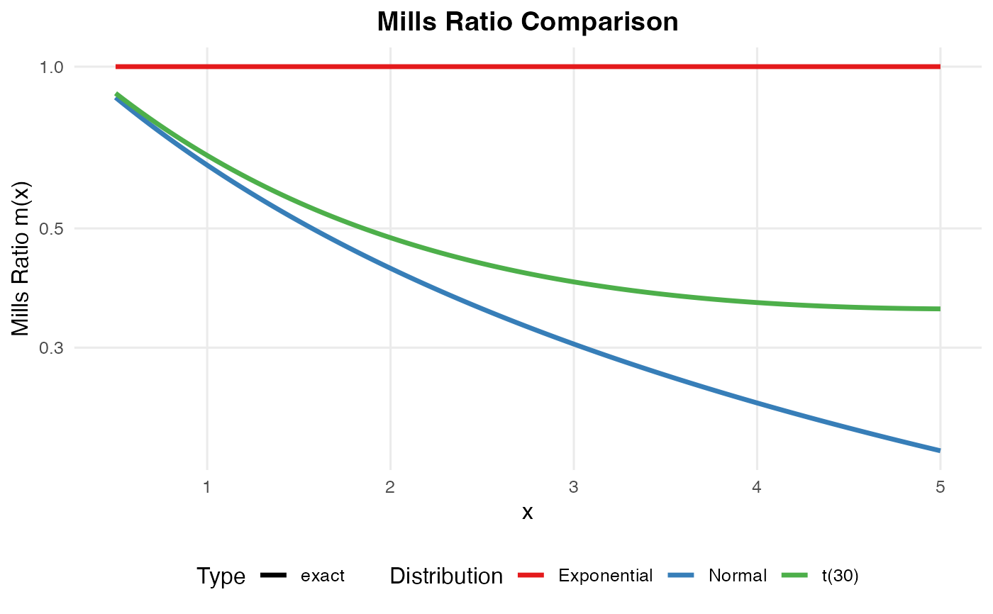
# Generate and plot Mills ratio curves
curves <- simulate_mills_curves(distributions = c("normal", "t30", "exponential"))
plot_mills_curves(curves, log_y = TRUE)